I started out art mainly with the computer with digital mediums. Mixing colours is one of the things I found very challenging at first. You cannot simply click a button to get the colour, value and saturation you want. Colour mixing is an important skill.
Mix the hue – generally
Mixing hues (i.e. the colour, like green, orange, purple) is a skill but one that takes time to master. With watercolour, the added medium is water which changes the transparency of the colours. It allows you to make glazes over dried ones which produces interesting effects of new colour combinations of pigment. This is what we learn in primary school – yellow + blue = green, red + blue = purple, etc.
Adjust the saturation
After mixing the hue generally, you then need to adjust the saturation level. Long ago, I read this book called Color by Betty Edwards. I learned that I needed to reduce the saturation of my paint. To do this, you need to mix the opposite primary colour on the colour wheel.
Example: Mixing Skintones and saturation
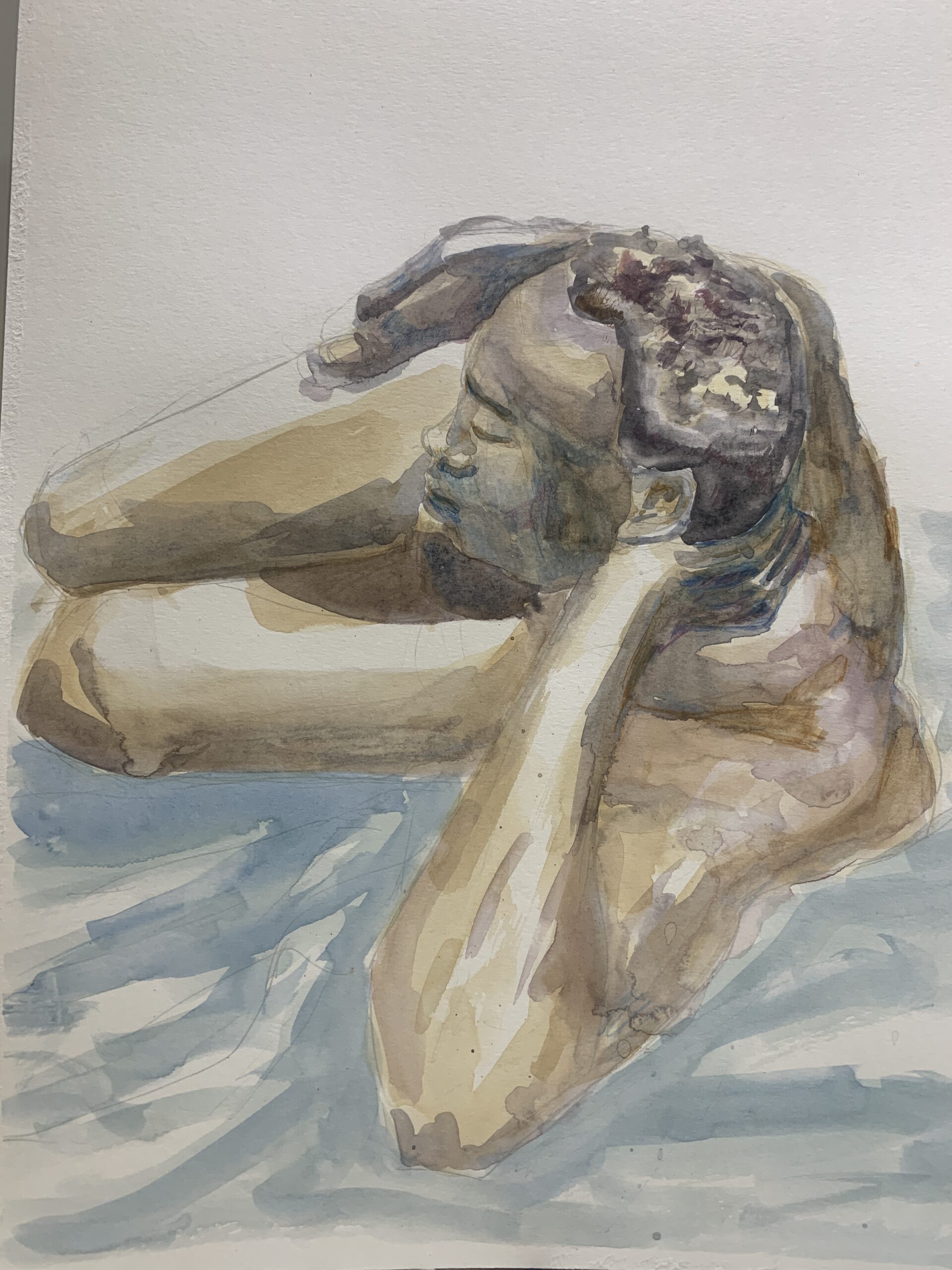
For skin tones in the above cover image, I used a mixture of yellow ochre and cadmium red. To reduce the saturation and tone it down, I would mix in some blues. The yellow/red primaries produce an orange colour, the opposite primary left out (blue) would reduce the saturation. Mixing yellow with purple will do the same, and red with green will also do the same. Every paint combination will vary on what colour is produced from the mix in the end.
Changing Values
I have struggled with the value in the paint and the consistency. Using more paint, i.e. not cheap-ing out on the water and paint ratio has helped. But also adding darker colours will make the value of the paint also darker.
But the number one tip…Test your paint before painting
The most important fix is to test out the colour of the paint before putting it on your paper. I have in my left hand a paper towel to see if the paint I have created is the one I wanted. It’s a lot of trial and error, but it prevents mistakes which cannot be fixed, particularly in watercolour.
Experiment and take risks
While I was painting the cover image, I actually did not like how the yellow turned out on the model’s skin. Then, I looked at what other colours others were using. I decided I would try using cerulean blue in the next layer. The shadows turned out beautifully to my surprise. In the final layer, we were instructed to add some watercolour pencil for the details and I really liked how that came out.
It certainly helped that I had to paint less of a figure by focusing on parts like the face in a foreshortened pose.
A new colour combination in the second painting

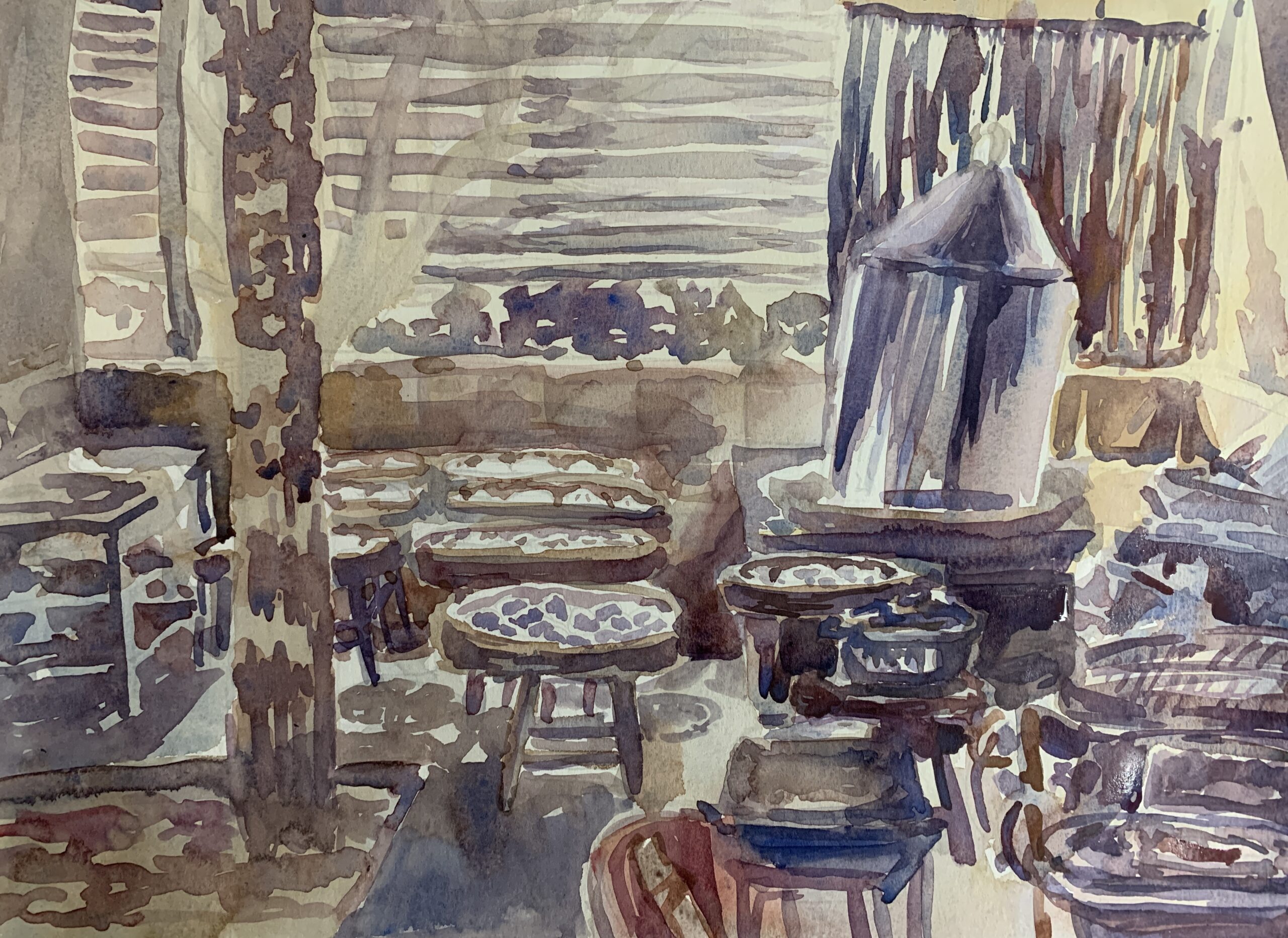
The second painting – well, I tried out a different colour combination and I still like it. This had a mixture of cadmium yellow & gamboge yellow, alizarian crimson, and ultramarine blue mainly. I like the combination of purples and darker hues on this.
Given that it was my first black model, I really focused on getting skin tone colours right. The amount of “white bodies” in our media being labelled as “beautiful” irks me, and I wanted to ensure the painting reflected the man’s skin tone properly.
What I learned is experimentation and taking that “risk” of “botching your painting” can really pay off – so I am very pleased.

