I tried to do a few John Singer Sargent style watercolours to see if I would learn anything new.
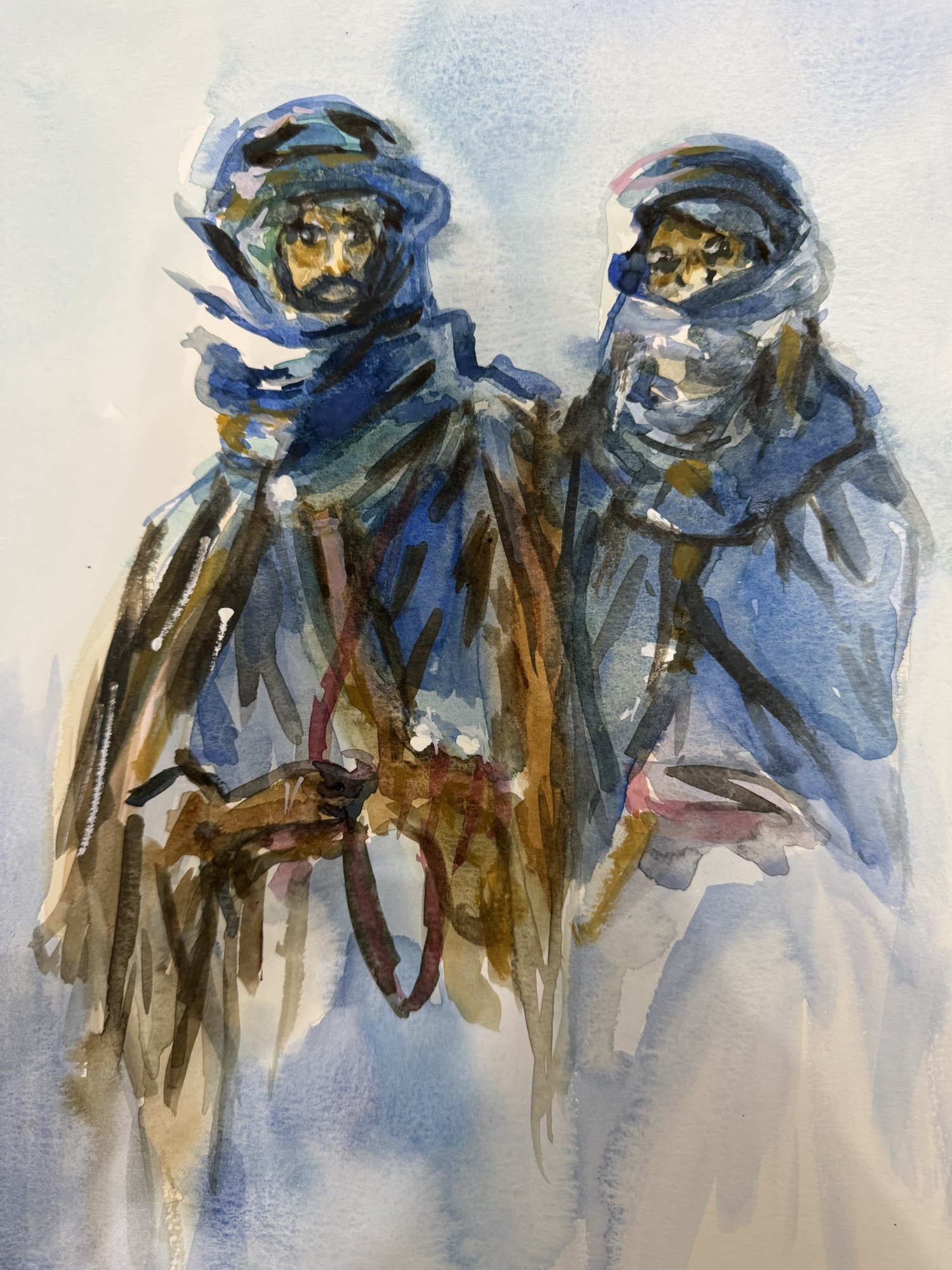
The first was the “Beaudoins”. What I found challenging was – well, I had not used enough of the canvas (considering the original was larger than mine) so getting the details was hard.
But I did learn a few things: having very opaque brush strokes can actually be professional rather than somewhat cartoony. Using opaque paint and gouache in this case made it interesting.

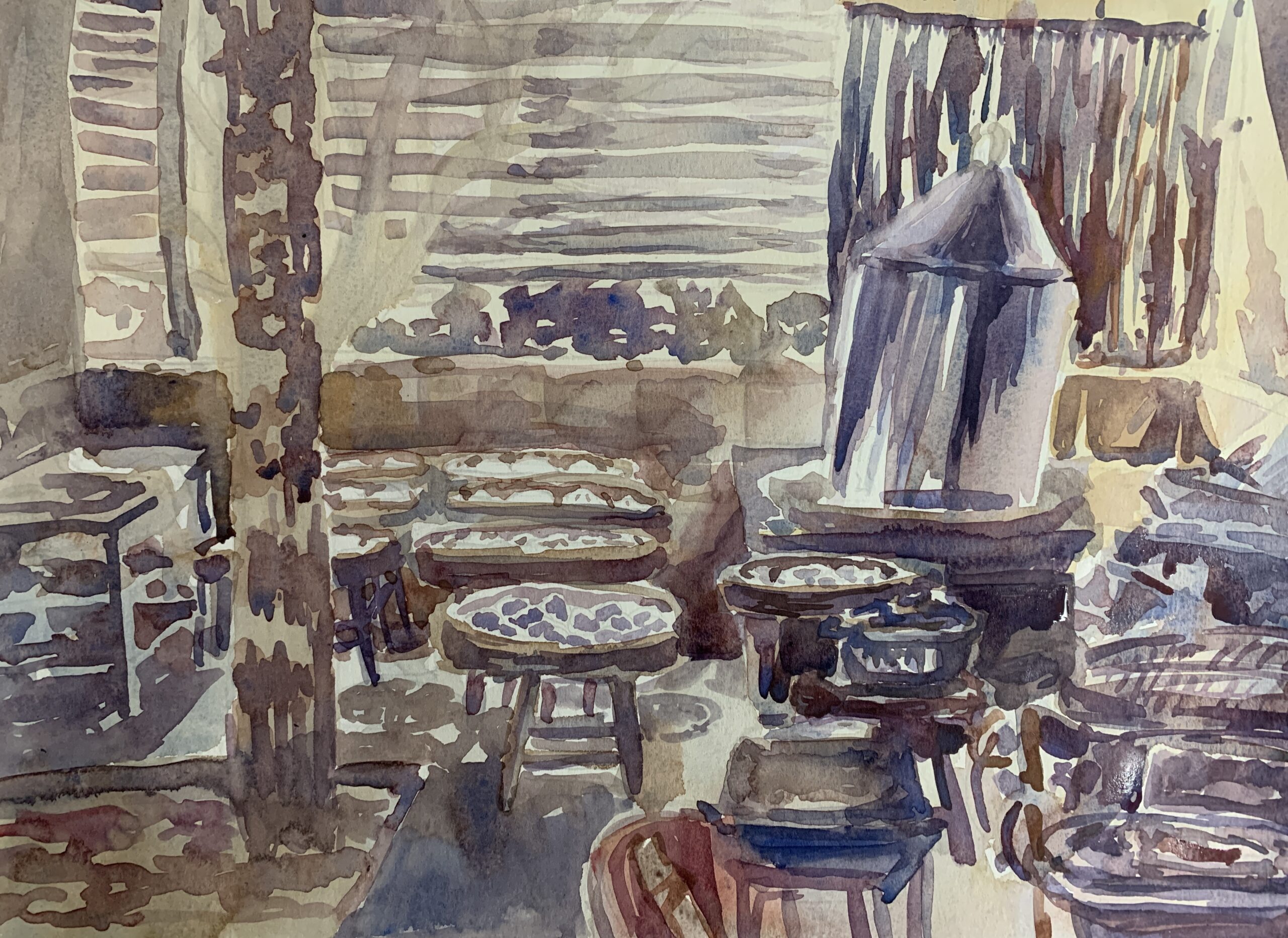
The next was this building called “Corfu”. I actually did this twice.
At first I thought: Oh, it’s just a building, will be easy to draw. On the first go, I found myself very confused with the colours and I sort of rushed a bit too much into it as I was too excited.
On the second go, I decided to try getting the colours more accurate. I also pulled out a ruler and made the perspective lines (guestimating somewhat). The drawing definitely was more accurate, though I ended up loosing space for the colourful leaves up top.

What surprised me was the actual varied colours in everything. While I would have thought it would clash, it comes together in a colour cacophony which is very much his style.
I’d say the second version turned out better, mainly because the drawing was more accurate. Also I realized how less was more, and that having more deliberate brush strokes (rather than coming back in and trying to muddy things up) was much more important to getting a definitive look in the end.